Curb-Cut Effect: How Digital Accessibility Enhances Usability for Everyone

Published on 02.04.2025

Anyone who’s ever pushed a stroller, wheeled a suitcase, or ridden a bike knows the value of lowered curbs. Originally designed for wheelchair users, curb cuts now make life easier for everyone. That’s exactly what the Curb-Cut Effect describes: a solution created for a specific group that ends up improving usability for (almost) all.

The Curb-Cut Effect in the Digital World

This concept applies just as powerfully online. Digital features designed to support people with disabilities often improve usability for all users. Accessible websites and apps offer a better overall user experience—and they also boost a brand’s reputation.

Examples: How Accessibility Improves UX

1. Voice Assistants: From Accessibility to Everyday Essential

Voice assistants like Siri and Alexa were originally developed for people with motor impairments. Today, they’re mainstream tools used by millions—while driving, cooking, or managing smart home devices. They save time, reduce friction, and make technology more inclusive.

2. Closed Captions

Closed captions (CC) were designed for Deaf and hard-of-hearing users, but their benefits go far beyond that. Viewing habits—especially among mobile users—have changed. With more people watching videos in public spaces—often without sound—captions are crucial. Gen Z in particular consumes a high volume of muted video content. Closed captions are therefore essential for effectively communicating a video’s message.

Captions don’t just show spoken words; they describe background sounds, music, and other important audio cues—essential for full comprehension. They’re also a big help for non-native speakers, people with learning difficulties, or anyone needing clearer, more focused information.

3. High Contrast and Adjustable Font Sizes

High contrast and larger fonts make reading easier for users with visual impairments. People in bright environments or using low-quality screens also benefit—for example, when reading the news outdoors in direct sunlight. High contrast and enlarged text can make the difference between frustration and effortless reading. Websites that allow users to adjust typography themselves provide a more comfortable experience in a wide range of situations.

4. Plain Language and Logical Structure

Complex sentence structures and technical jargon make content harder to understand for many users. Clear language with familiar terms helps not only people with cognitive impairments, but also those who are in a hurry, tired, or not fluent in the language. A well-structured layout also supports easier navigation—both for users who tend to scan content and for screen reader users who navigate by headings.

How Companies Can Implement Accessibility

You don’t need a big budget to start making your digital content more accessible. Here are some quick wins that immediately improve user experience through accessibility:

  • Captions and transcripts for videos: YouTube’s auto-captioning makes it easy to provide basic accessibility. Tools like Otter.ai can automatically generate transcripts to make video content more accessible and searchable.
  • Plain language and clear structure: Avoid jargon—or explain it clearly. Headings should organize content, not just serve as visual design elements. A logical structure helps all users, especially those using assistive technologies.
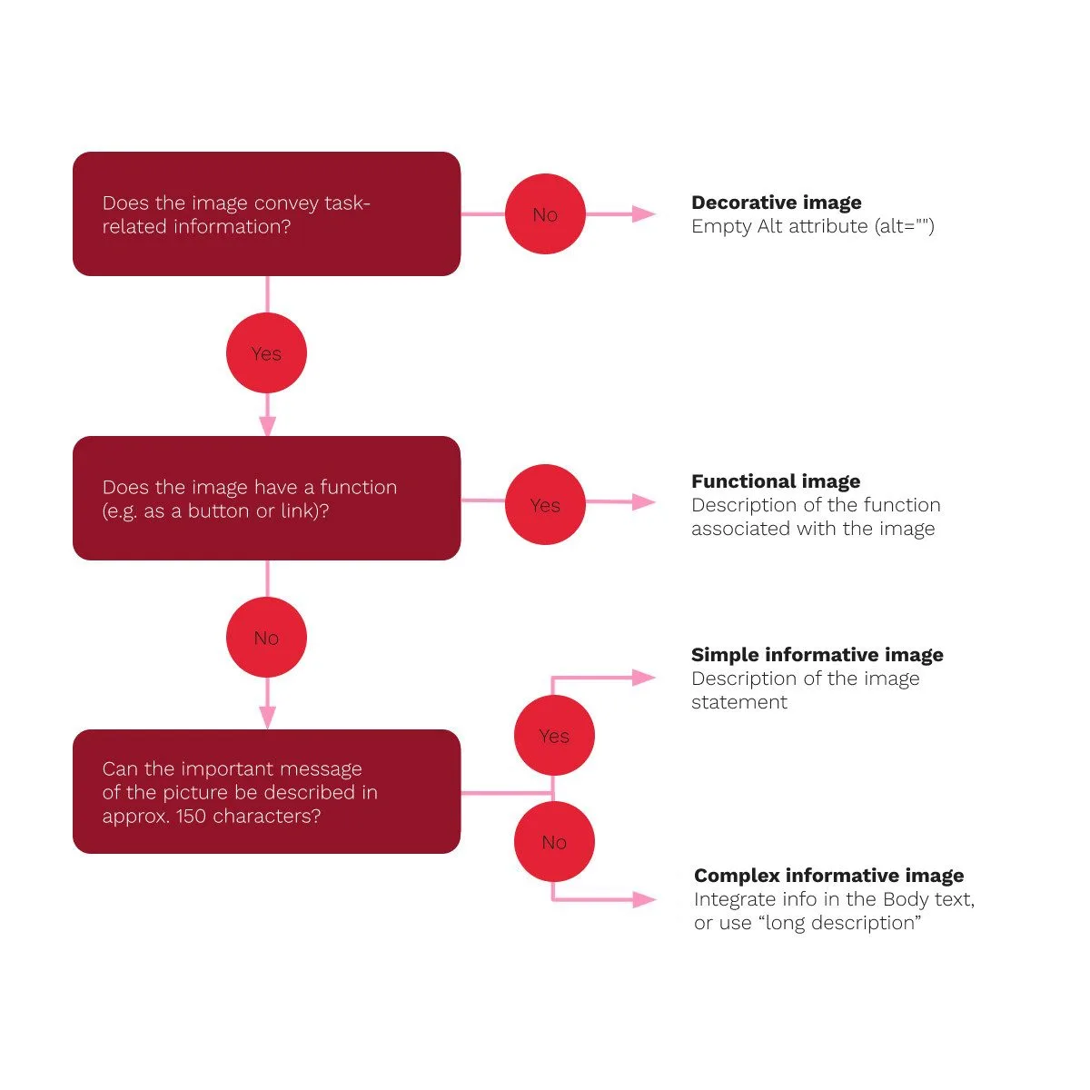
  • Alt text for images (for screen readers): The following guidelines can help determine how to write effective alt text:
    • Leave the alt attribute empty if the image is purely decorative.
    • Describe the function if the image serves as an icon or button.
    • Provide a brief description if the image conveys important content.
    • For complex visuals like infographics, use a “long description” or explain the content in the body text.
  • Good contrast and scalable typography: Make sure key elements have sufficient contrast so they’re easily visible to all users. Scalable fonts ensure content stays legible on mobile devices and allow users with visual impairments to zoom in to their preferred level of readability.
  • Accessible forms: Every input field should have a clear label so screen reader users know exactly what’s being asked. It’s also important to inform users when an input error occurs—don’t rely on color alone. Use symbols or icons in addition, and make sure error messages are descriptive and helpful, not generic.

Why Digital Accessibility Pays Off for Businesses

Accessibility offers value not only for users but also for companies:

1. Reaching a Broader Audience

It’s not just permanent disabilities that create barriers. Temporary limitations—like a broken arm, multitasking while driving or parenting, or language challenges—can also prevent users from accessing content. Companies that design with accessibility in mind reach more people and extend their market reach.

2. SEO Benefits & Better Usability

Accessible websites often feature a clear structure, easy-to-understand content, and an optimized navigation. This not only improves the user experience but also boosts visibility in search engines:

  • Better navigation improves usability and reduces bounce rates.
  • Captions and transcripts make videos easier to find and improve content indexing.
  • A clean structure with meaningful headings helps both users and search engines better understand the content.

3. Positive Brand Image & Driving Innovation

Companies that champion inclusive design are seen as socially responsible and innovative. Additionally, working on accessibility often leads to better, more thoughtfully developed products that benefit all users.

The Curb-Cut Effect shows that accessibility doesn’t just benefit a small group—it improves the overall user experience for everyone. Digital inclusion enhances usability, boosts SEO, expands reach, and strengthens brand image. Companies that act now will see long-term benefits and send a strong message for a more accessible digital future.

Interested
in a chat?